How to Teach the Principles of Design to Kids (K–9 Guide)
Oct 30, 2026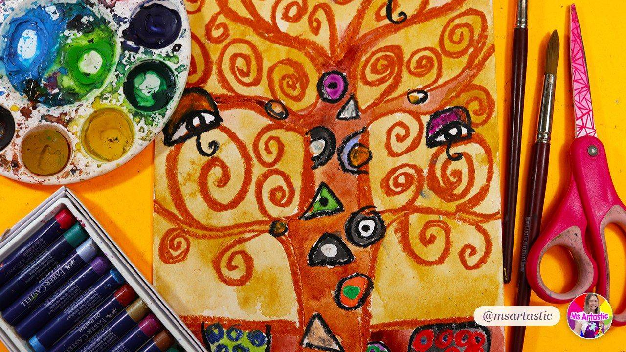
If you've ever stood at the front of the art room and said "today we're learning about rhythm" and watched a room full of kids picture a drum set, you're in good company. The principles of design can feel slippery to teach. The elements of art are the ingredients we can point to (a line, a color, a shape), but the principles are about how those ingredients are arranged, and that's a lot more abstract for a seven-year-old.
So let's talk about how to teach the principles of design in a way that actually sticks, from kindergarten all the way up to middle school. Grab your coffee. I'll walk you through what each principle means in kid-friendly words, the order I like to teach them in, project ideas that make each one visible, and how to check that students really understand it (not just that they made something pretty).
What Are the Principles of Design (and How Are They Different From the Elements of Art)?
Here's the simplest way I explain it to students: the elements of art are the ingredients, and the principles of design are the recipe. Line, shape, form, color, value, space and texture are the things an artist works with. Balance, contrast, emphasis, movement, pattern, rhythm, proportion, unity and variety are the ways an artist arranges those things so a picture feels a certain way.
That little metaphor does a lot of heavy lifting. Kids already understand that the same ingredients can make very different things depending on how you put them together. Flour, eggs and sugar can become pancakes or a cake. Five lines and three colors can become a calm landscape or a wild, busy abstract.
If your students haven't had much practice with the elements yet, start there first. My guide to teaching the elements of art to kids walks through each one, and the principles will make far more sense once kids can name what they're arranging.
Different books and curriculums list slightly different principles. You'll see anywhere from seven to ten. In the Artastic Collective I teach balance, contrast, emphasis, movement, pattern and repetition, proportion, rhythm, and unity and variety, with harmony folded in alongside unity. Don't let the different lists stress you out. What matters is that kids learn the vocabulary, see it in real artwork, and use it on purpose in their own work.
The Principles of Design Explained in Kid-Friendly Words
Before you teach any principle, it helps to have one short sentence you repeat every single time. Kids hang on to that sentence long after the lesson. Here are the ones I use.
Balance
Balance is how the visual weight is spread out in an artwork. Symmetrical balance is the same on both sides, like a butterfly. Asymmetrical balance is different on each side but still feels even, like a big shape on one side and a few small shapes on the other. Radial balance spreads out from the center, like a flower or a mandala. Little ones love folding paper in half to discover symmetry, and older students can play with asymmetry and feel the difference.
Contrast
Contrast is putting very different things next to each other so they stand out. Light and dark, warm and cool, rough and smooth, big and small. If you've already taught value, contrast is a natural next step. (My post on how to teach value in art pairs well here.)
Emphasis
Emphasis is the part of the artwork your eye goes to first. I call it the "star of the show." Artists create emphasis with contrast, size, color, placement or detail. A great question to ask students is simply, "Where did your eye land first, and why?"
Movement
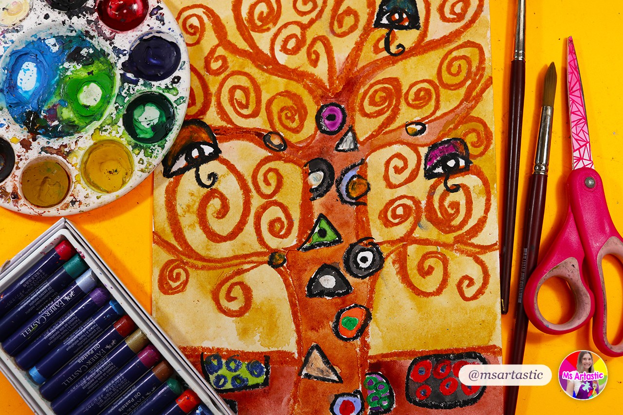
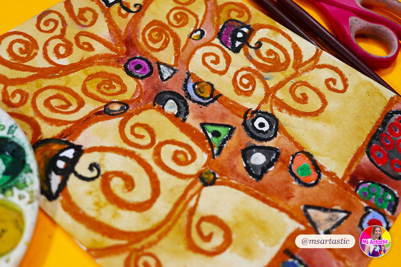
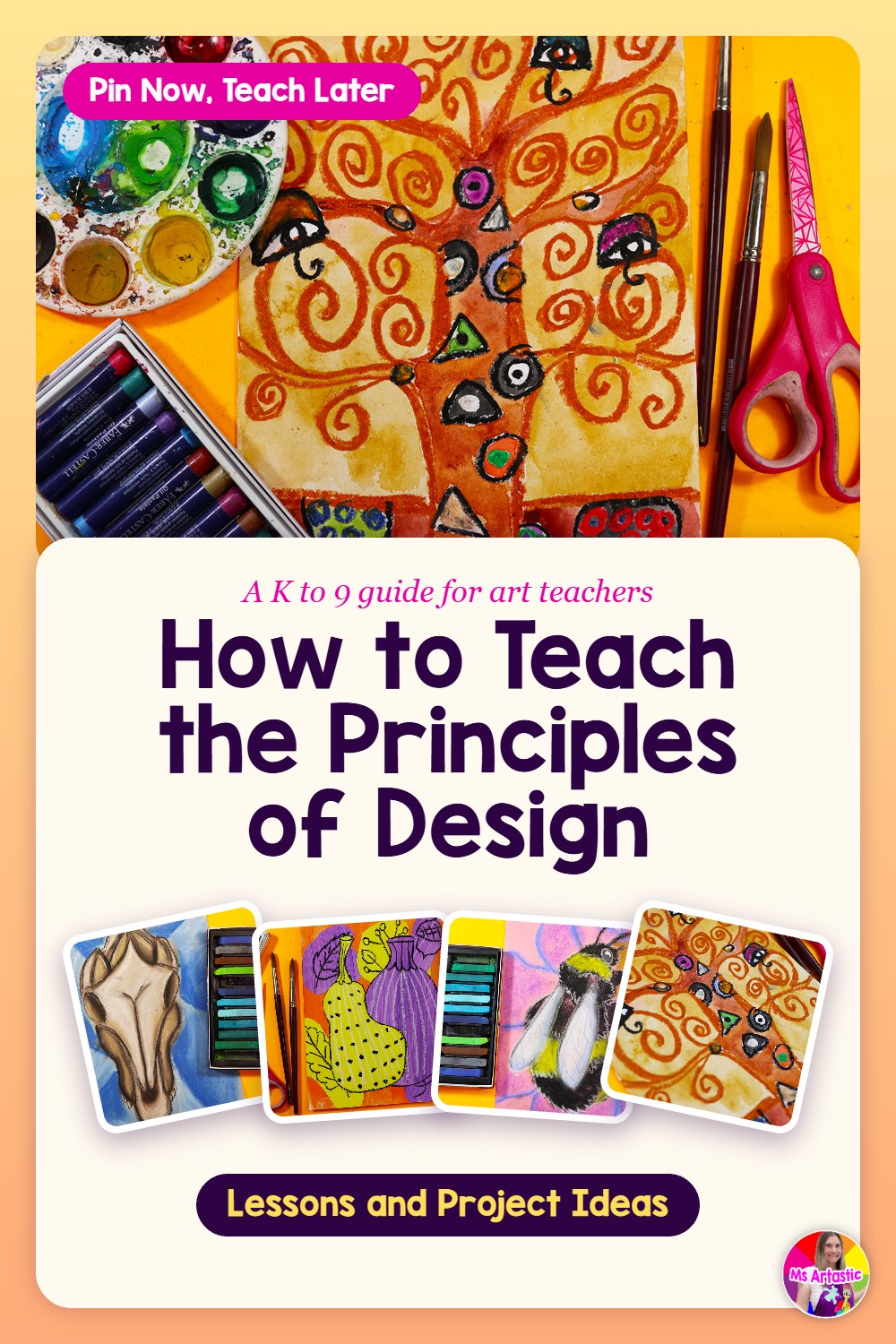
Movement is the path your eye travels through an artwork. Swirling lines, curving shapes and repeated marks can pull your eye around the page. Gustav Klimt's Tree of Life, with all those spiraling branches, is one of my favorite ways to show kids how lines can make a picture feel like it's moving even though nothing actually moves.
Pattern and Repetition
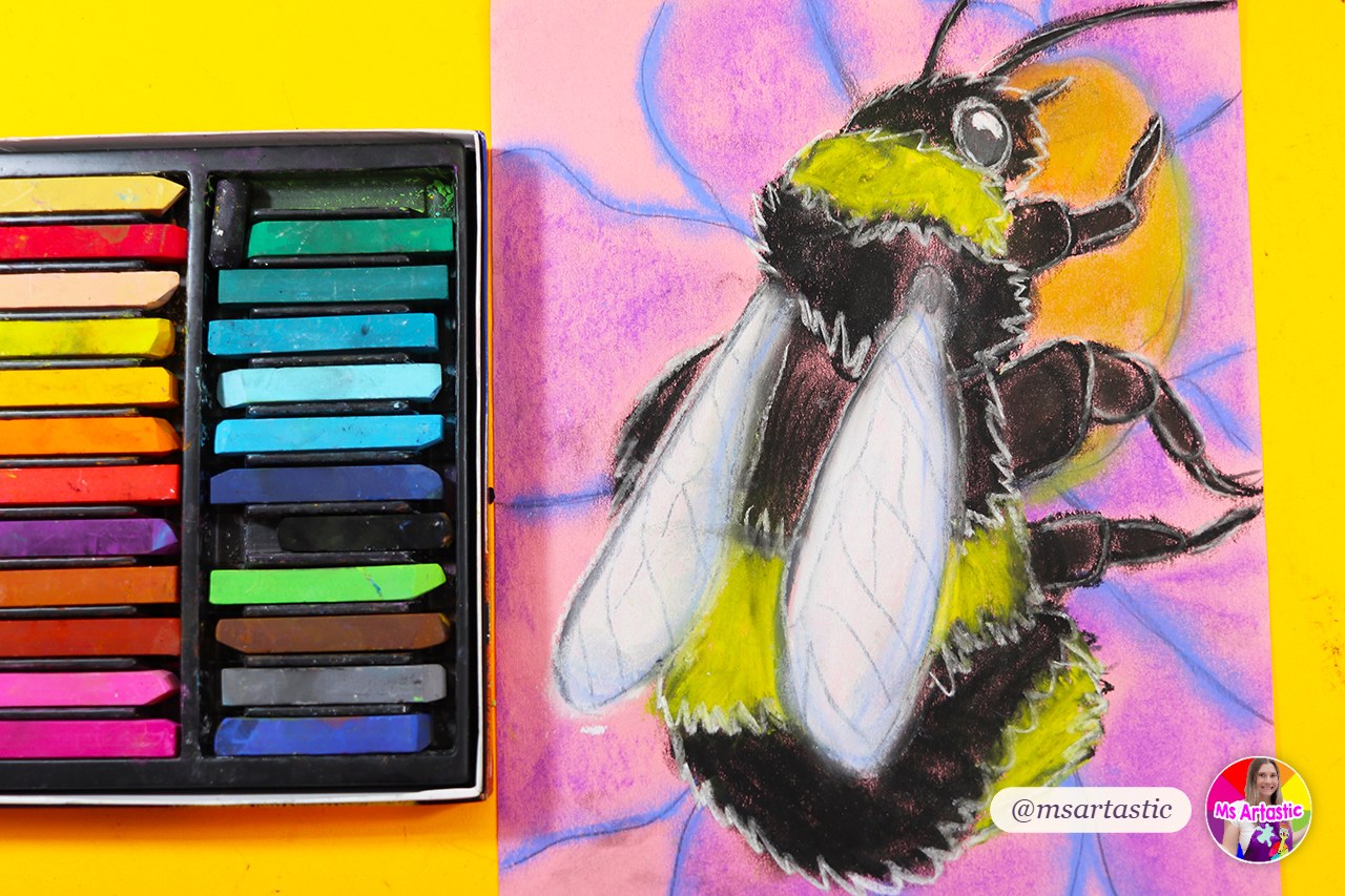
Pattern is a design that repeats in a planned way. Repetition is using the same element again and again. Kids are natural pattern makers, so this is a wonderful early principle. Peacock feathers, bee stripes, wrapping paper and their own sweaters are all perfect examples.
Rhythm
Rhythm is repetition that creates a beat or a feeling of timing. This is where the drum set confusion comes in, so I lean into it. Clap a steady beat, then clap a pattern that speeds up, and ask students how they could draw each one. Regular rhythm, alternating rhythm and flowing rhythm suddenly make sense when they can hear them first.
Proportion
Proportion is how the sizes of things compare to each other. A head that's too small for a body, a giant turtle next to a tiny fish. Proportion can be realistic or exaggerated on purpose, and older students love the "on purpose" part.
Unity and Variety
Unity is the feeling that everything in an artwork belongs together. Variety is the differences that keep it interesting. I teach these as a pair because they balance each other. Too much unity can feel boring. Too much variety can feel chaotic. The sweet spot is a piece that feels like one family with a few fun cousins.
What Order Should You Teach the Principles of Design?
There's no single right order, but there is a kind order. I like to start with the principles kids can see and touch, then move toward the ones that are more about feeling.
- Pattern and repetition come first because even the youngest students can make them successfully.
- Balance is next, starting with symmetry (fold and see) and growing into asymmetry for older grades.
- Contrast builds right on top of the value and color work students have already done.
- Emphasis follows naturally, because contrast is one of the main ways artists create a focal point.
- Movement and rhythm come once students understand repetition, since rhythm is really repetition with a beat.
- Proportion fits wherever you're doing figures, animals or still life.
- Unity and variety make a lovely capstone, because they ask students to think about the whole artwork at once.
If you're mapping this across a whole year, my post on how to plan a year of art lessons without getting overwhelmed shows how to weave units like this through the calendar so you're not cramming everything into one month. There's also a longer version on my main blog: how to plan a full year of art lessons without losing your weekends.
How to Teach the Principles of Design by Grade Level
The principles themselves don't change between kindergarten and eighth grade. What changes is the depth. Here's roughly how I think about it.
Principles of Design for Kindergarten to 2nd Grade
Keep it concrete and joyful. One principle per project, one simple sentence, and lots of "show me" moments. Young students can absolutely learn the words balance, pattern, contrast and movement, especially when the project makes the idea obvious. A bug with matching wings on both sides makes symmetry click. A firefly glowing against a dark sky makes contrast click. A shooting star with a swooshing tail makes movement click. You'll find all of those inside the Artastic Collective Elements and Principles collection for Pre-K to Grade 2.
Principles of Design for 3rd to 5th Grade
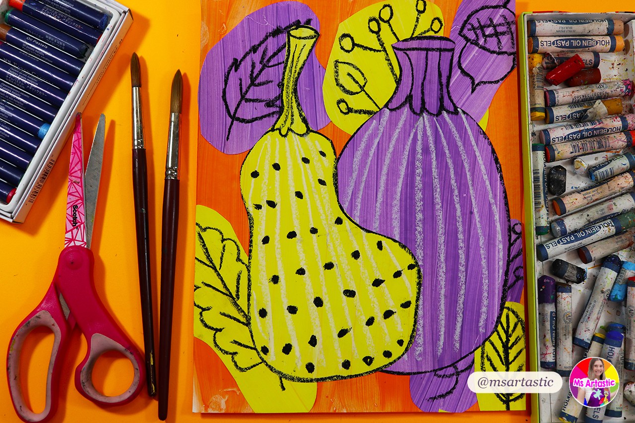
This is the age where students can start choosing how to use a principle, not just following along. They can plan an asymmetrical abstract, compare two artworks and explain which one has stronger contrast, or talk about why an artist chose to repeat a shape. Artist connections work beautifully here. Klimt's swirling Tree of Life for movement and a bumblebee for unity are two lessons written for this grade band.
Principles of Design for Middle School (6th to 9th Grade)
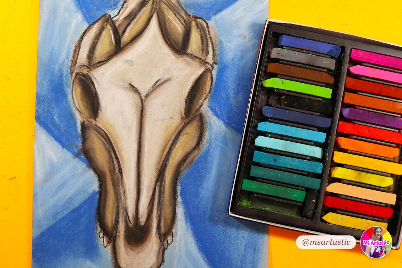
Older students are ready to analyze, critique and break the rules on purpose. Ask them to identify two or three principles working together in one artwork. Give them a design challenge where they have to create emphasis using only value, or rhythm using only one shape. Georgia O'Keeffe's cow skull paintings are a wonderful study in emphasis, and exaggerated proportion projects give middle schoolers a great excuse to be a little bit silly while learning something real.
A Simple Lesson Flow That Works for Any Principle
Whatever principle you're teaching, this five-part flow keeps the lesson focused and gives students several chances to understand the idea before they're asked to use it.
- Hook (5 minutes): Show one artwork and ask one question. "What's the first thing you notice?" or "Is this side the same as that side?"
- Name it (5 minutes): Introduce the word and your one-sentence definition. Write it on the board and have students say it back.
- See it (5 to 10 minutes): Look at two or three more examples, including at least one by a well-known artist and one by a student their age.
- Make it (the bulk of the class): A project where the principle is the main goal, not a side note. Demonstrate the key steps and keep the rest open for choice.
- Talk about it (5 minutes): End with reflection. "Where did you use emphasis? How did you make it stand out?"
That last step is the one we skip most when time runs short, and it's the one that turns a fun project into real learning. If you want a few ready-to-go phrases for that conversation, my post on how to talk to kids about their art has plenty.
For a deeper look at building the plan itself, see how to write an art lesson plan step by step.
See the Principles of Design Lessons in the Artastic Collective
Project Ideas for Each Principle of Design
Here are project ideas that make each principle the obvious star of the show. These are all real lessons inside the Artastic Collective, with grade bands so you can match them to your students.
- Balance: a symmetrical bug (Pre-K to 2), a balanced frog (K to 3), an abstract artwork exploring balance (3 to 5), and a bird and feathers piece (6 to 9).
- Contrast: a glowing firefly (K to 2), animal eyes (3 to 5), and a contrasting flower (6 to 9).
- Emphasis: a Georgia O'Keeffe-inspired cow skull (6 to 9).
- Movement: a shooting star (K to 2), a Gustav Klimt Tree of Life (2 to 5), and a giant squid (6 to 9).
- Pattern and repetition: a patterned bee (Pre-K to 2), a peacock (K to 3), and "Something Below" for repetition (6 to 9).
- Rhythm: ladybugs (6 to 9).
- Proportion: a giant turtle and a proportion bird (6 to 9).
- Unity, variety and harmony: a bumblebee for unity (2 to 5), a pear for variety (4 to 7), a harmony tree (3 to 5), and a sunflower for unity (6 to 9).
If you'd rather start with a single resource, my Principles of Design worksheets and art activities are a helpful introduction for upper elementary and middle school, and the Principles of Design classroom posters keep the vocabulary on the wall all year. The Georgia O'Keeffe Cow Skull art project is also available on its own if emphasis is your focus.
How to Assess the Principles of Design
Here's the honest truth: a beautiful finished piece doesn't always mean a student understands the principle. Sometimes kids follow the steps and the principle shows up by accident. So I like to assess two things separately: did they use it, and can they explain it.
- A focused rubric: Keep one row of your rubric just for the principle. "I used contrast to make my subject stand out" is clearer than a general "good composition" row.
- Reflection pages: A few short questions after the project. "Which principle did you use? Point to where you used it. What would you change next time?"
- Quick partner talks: Students swap artworks and find the principle in each other's work. It's fast, it's social, and you'll hear right away who gets it.
- Artist statements: Older students can write two or three sentences about their choices, using the vocabulary.
That's exactly why the lessons in the Artastic Collective come with rubrics and reflection pages built in, so you're not writing them from scratch at ten o'clock at night.
What's Inside an Artastic Collective Lesson
If you're looking for a principles of design curriculum you can actually teach tomorrow, this is what you'll find inside the lessons in the membership: a finished example to show students, step-by-step slides you can project, step-by-step handouts, a lesson plan, rubrics and assessment pages, and reflection pages. Many lessons also include a full video tutorial you can play for the class or watch yourself the night before. The Klimt Tree of Life lesson, for example, has a thirty-minute step-by-step video and lists the National Core Arts Standards it connects to.
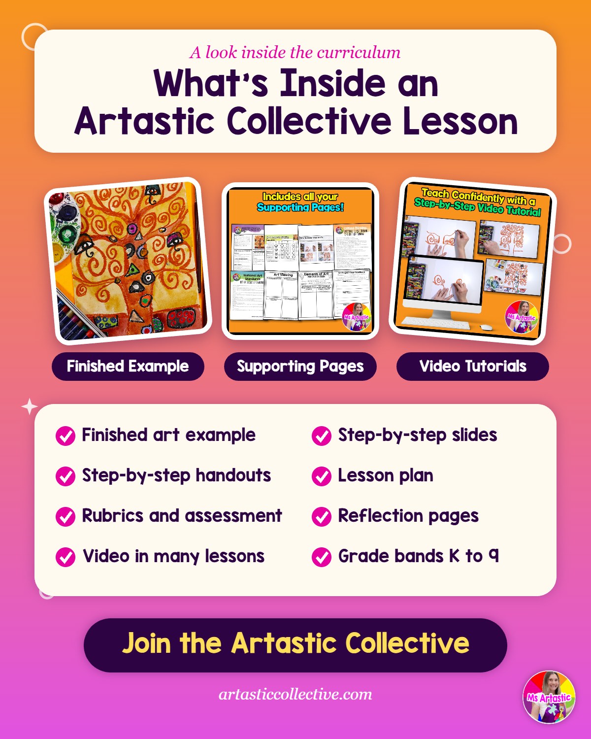
The Elements and Principles collection alone has thirty modules, with separate bundles for Pre-K to Grade 2, Grades 3 to 5 and Grades 6 to 9, so you can teach the same principle at the right depth for every class you have. And it sits right next to the Artists and Art History, Holidays and Seasonal, Sketchbooks and Year Planner collections, so the principles connect to everything else you're teaching.
Learn More About the Artastic Collective
Want to Try a Lesson First? Grab a Free Art Lesson
If you'd like to see how I teach before you commit to anything, my Free Art Lesson Library has lessons for teachers and homeschool families that you can use right away. You'll also get my newsletter with teaching ideas, seasonal lessons and the occasional encouraging note when the art room is a lot.
Get the Free Art Lesson Library
Teaching the Principles of Design at Home
Homeschool families, this is for you too. The principles of design are wonderful to teach at home because you can find them everywhere: the symmetry in a leaf on your walk, the pattern on a quilt, the contrast of a red cardinal against snow. Try a "principle hunt" around the house or the grocery store, then make one small artwork that uses what you found.
If you're teaching more than one age at the same table, choose one principle and let each child work at their own level. Your youngest might make a symmetrical bug while your oldest plans an asymmetrical composition. My post on teaching art to mixed ages has more ideas for making that work without losing your mind.
Principles of Design FAQ
How many principles of design are there?
It depends on the source. Most lists include somewhere between seven and ten: balance, contrast, emphasis, movement, pattern, repetition, rhythm, proportion, unity and variety, with harmony sometimes added. Pick the list that matches your standards or curriculum and use it consistently, so students hear the same words all year.
What age should kids start learning the principles of design?
Even kindergarteners can learn pattern, balance and contrast when the project makes the idea easy to see. Keep the vocabulary simple and repeat it often. By upper elementary, students can start choosing and explaining principles on their own.
Should I teach the elements of art before the principles of design?
Usually, yes. The principles describe how the elements are arranged, so students need to know what a line, shape or color is before they can talk about balancing or repeating them. That said, you don't need to finish every element first. Pattern pairs nicely with line, and contrast pairs nicely with value.
How do I explain the difference between pattern and rhythm?
Pattern is the repeated design itself. Rhythm is the feeling of timing or beat that repetition creates as your eye moves across it. Clapping a beat first and then drawing it is the easiest way I know to make that difference click.
Is there a principles of design curriculum for K to 9?
Yes. The Artastic Collective includes an Elements and Principles collection with lessons for Pre-K to Grade 2, Grades 3 to 5 and Grades 6 to 9, plus lessons organized by each principle, so you can teach the same idea at every grade level.
Let's Make the Principles of Design Feel Doable
The principles of design don't have to be the unit you dread. Give each one a short, repeatable definition, start with what kids can see and touch, build in a reflection at the end, and connect it to real artists. Your students will start using words like emphasis and movement on their own, and that's one of the best feelings in this job.
If you want every one of these lessons planned for you, with the slides, handouts, rubrics and reflection pages ready to print, I'd love to have you in the Artastic Collective.
Happy teaching,
Kathleen (Ms Artastic)
Discover FREE Art Lessons & Resources
Let's Make Some Art! I will create the Art Lessons & Resources, you inspire the kids!
Stay connected with news and updates!
Join our mailing list to receive the latest news and updates from our team.
Don't worry, your information will not be shared.
We hate SPAM. We will never sell your information, for any reason.
Ms Artastic